As we enter into our third year of unprecedented times, one would assume it is likely to start as bleak as ever, and I think we all can agree the fatigue is setting in. While these unprecedented times have shaped our new normal, I feel a sense of transformation and hope for our future. As we look at the bigger picture to see what is taking place in our global culture, there is an overwhelming sense of optimism. People are craving balance, happiness, health, spontaneity and connection. Pantone put it best: “We are living in transformative times. Pantone 17-3938 Very Peri is a symbol of the global zeitgeist of the moment and the transition we are going through. As we emerge from an intense period of isolation, our notions and standards are changing, and our physical and digital lives have merged in new ways.”
For the first time, the Pantone Color Institute created a brand new color in the form of Pantone 17-3938 Very Peri as the Pantone Color of the Year 2022. In the words of Laurie Pressman, Vice President of the Pantone Color Institute: “Creating a new color for the first time in the history of our Pantone Color of the Year educational color program reflects the global innovation and transformation taking place. As society continues to recognize color as a critical form of communication, and a way to express and affect ideas and emotions and engage and connect, the complexity of this new red violet infused blue hue highlights the expansive possibilities that lay before us.”

Like most designers, I love to see what professionals are saying about trending colors. The color experts at Pantone suggest that the hues typically choose themselves based on fashion trends, popular imagery, buzzwords across cultures and simply how certain colors makes us feel.
If someone asked you to describe where they may have seen Pantone’s Very Peri in recent media, they would likely mention HBO’s hit series Euphoria. The show is no stranger to its artistic direction and use of purples. It often boasts a fantastical dream logic and delivers a series of indelible images in each episode. If you look up “euphoria” in the dictionary and compare it to Pantone’s Very Peri, there are a handful of similarities in their definitions including happiness, joyous and excitement. The essence of Very Peri is euphoria. However, if you asked an entirely separate group of people, they may tell you to look no further than the front door of Monica and Rachel’s apartment from Friends.

A fellow designer, Christina (Instagram.com/astronuggie), collaborated with Govee and Pantone to bring Very Peri to life in her home gaming setup that she built herself. Leatrice Eiseman, Executive Director of the Pantone Color Institute said, “There is just no question that gaming influenced the continued usage of Very Peri.” Even Microsoft Teams had a hand in this year’s color selection, pairing up with Pantone to bring the Color of the Year to life across Microsoft products, infusing them with Very Peri.
What I love most about this year’s Color of the Year is that it feels fresh. It’s not easy to use the color purple in design and many will tell you it’s a difficult color to wear. In order to use Very Peri successfully, one needs to be creative, bold and unique like the color itself.

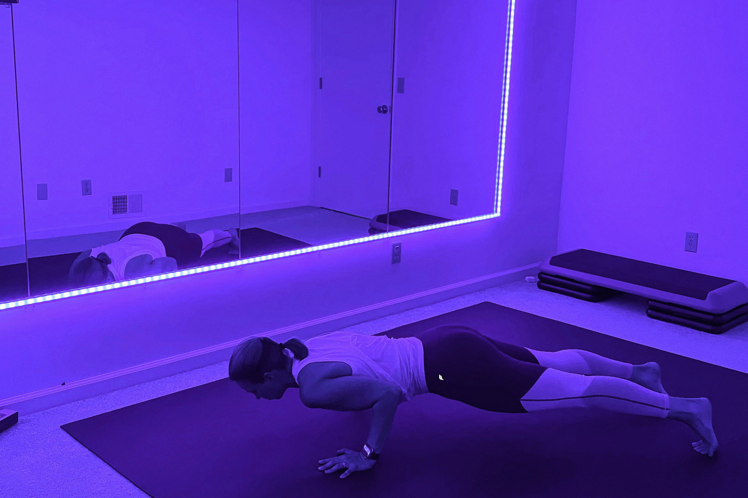
At what age does a person grow out of people asking what their favorite color is? If you were to ask me today, I would say Very Peri. My beloved yoga mat, my very own Govee light set up in my workout room, my favorite pair of pajamas and even my current nail color are all a similar hue. I hope I am not challenging the universe when I say that I am optimistic for 2022. As we trail blaze through 2022, let us keep the energy of this color in mind: “Pantone 17-3938 Very Peri encourages personal inventiveness and creativity, displaying a carefree confidence and a daring curiosity that animates our creative spirit. It helps us to embrace this altered landscape of possibilities, opening us up to a new vision as we rewrite our lives.”
