Written by Jacquelene Dent, Senior Associate, and Samantha Beiter, Associate.
Pantone’s 2026 Color of the Year has arrived—and we are, to put it nicely, extremely underwhelmed. After several years of rich, expressive hues that celebrated depth, warmth, and vibrancy, this year’s unveiling has landed with a thud, leaving the design community—and people at large—with far more questions than clarity.
In an article published by PRINT magazine, Amelia Nash captures the collective sentiment perfectly:
“You would think that a white called Cloud Dancer—described as billowy, serene, and light enough to soothe a ‘frenetic society’—would float gracefully into the zeitgeist. Instead, it plummeted like a deflated balloon at a party no one agreed to host.”
Pantone has long claimed that its Color of the Year is meant to reflect “what is happening in our global culture at a specific moment in time.” Which begs the question: how did we arrive at white?
Cloud Dancer is described as a “respite” and a “blank canvas,” intended to uplift and inspire. And while we don’t disagree that the turbulence of 2025 left many of us craving calm—a collective exhale after a year marked by uncertainty and anxiety—Pantone’s answer feels less like relief and more like the design equivalent of the landlord special.
If you were to compare photographs of interiors from a century ago to today’s prevailing design trends, the contrast would be striking. Historically, interiors were layered with color and pattern, reflecting craftsmanship, personality, and pride. Over time, particularly during periods of social or economic instability, color tends to retreat. If Cloud Dancer is meant to set the tone for what’s ahead, it doesn’t point toward optimism—or even direction—but rather toward hesitation.
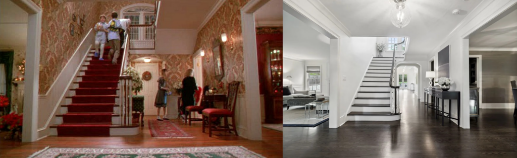
The public response was swift and vocal. From TikTok to LinkedIn, designers and everyday observers alike expressed confusion and disappointment. One recurring visual comparison made the rounds online: a foyer reminiscent of the warm, character-filled home in Home Alone, juxtaposed against a contemporary all-white interior. Cozy reds and patterned wallpaper replaced by blank walls and stark finishes. The absence of color begs the question—is this where we’re headed?
Pantone claims that Cloud Dancer provides “peace in a noisy world,” yet this framing feels disconnected from the global culture they claim to interpret. Peace does not have to mean silence, nor does calm require sterility. As humans, we have an innate need to express—through art, architecture, poetry, music, and the spaces we inhabit. Elevating a historically neutral color as a defining cultural statement risks disregarding the very essence of human creativity.
From a branding and product development standpoint, the choice feels equally puzzling. White—dreamy or otherwise—has been a staple for decades. Repackaging it as the Color of the Year, only to monetize it through limited-edition products, feels less like innovation and more like a hollow exercise in consumerism.
Pantone positions itself as a global color authority, a trendsetter that helps shape the visual language of our world. Cloud Dancer is described as airy, ethereal, calming, and relaxing. What these descriptors fail to acknowledge is the duality of white. While it can offer clarity and relief in the right context, it also carries connotations of coldness, sterility, and emotional distance. Used sparingly, it can elevate surrounding color. Overused—as this announcement seems to encourage—it becomes jarring and uninviting.
Which leads us to wonder: was this choice meant to provoke? Or does it quietly foreshadow further global uncertainty?
The push toward conformity has rendered many of our spaces colorless. Homes, commercial buildings, and fashion have already been stripped of pattern and personality in the name of neutrality and resale value. To elevate the absence of color as a cultural milestone feels like a step backward, not forward. An overabundance of white communicates impermanence—it tells us not to linger.
In response to this surprising choice, we present spaces we’ve designed that instead celebrate expression, identity, and humanity. Spaces that invite you to sit down, stay awhile, and feel something. Because now, more than ever, the world doesn’t need less color—it needs more.

Grand Center Arts Academy – Sun Theater
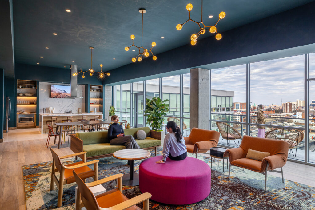
One Foundry Way
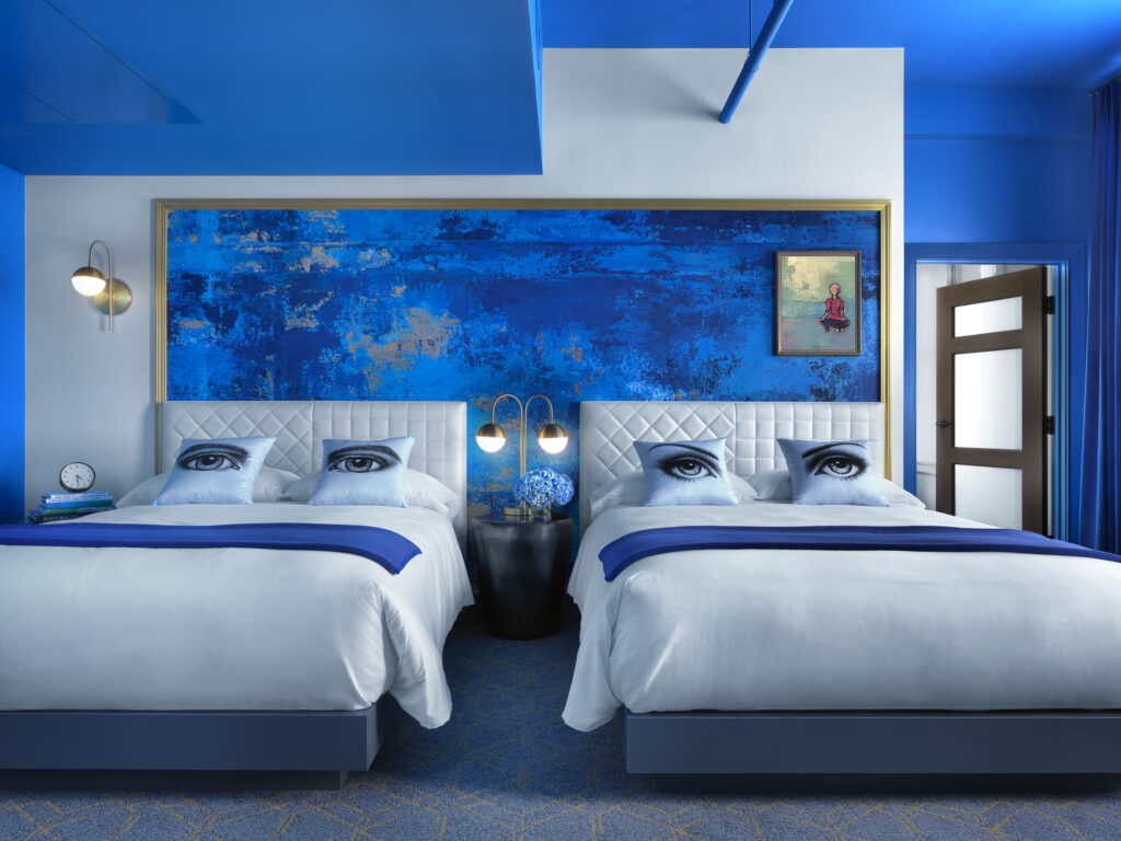
Angad Arts Hotel
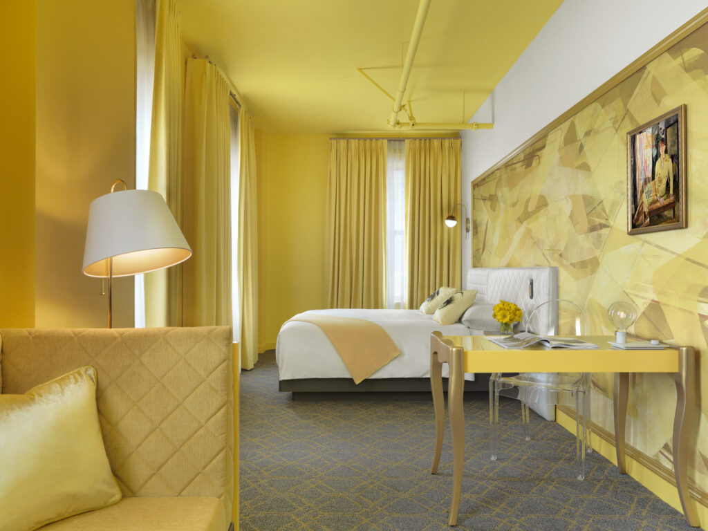
Angad Arts Hotel