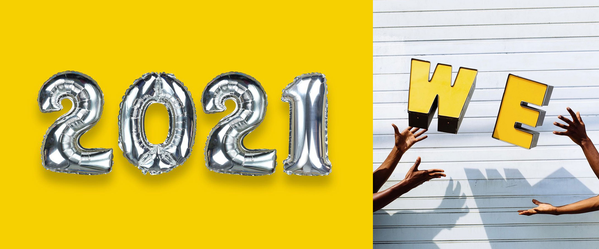
Breaking news for designers and non-designers alike who could not get enough of the gray and [insert pop of color] trend from 2013 – IT’S BACK. Yes, you heard that correctly. The Pantone Color Institute released their color predictions back in December in the form of PANTONE 17-5104 Ultimate Gray + PANTONE 13-0647 Illuminating as the Pantone Color(s) of the Year 2021. Pantone describes this year’s colors as “two independent colors that highlight how different elements come together and support one another.” They are meant to be warming and optimistic, exude strength and positivity, and represent the essence of the human spirit. While the colors themselves have names that should spark hopefulness, positivity and serenity, I needed a couple months to be convinced.
Like most designers, I love to see what the experts are saying about the colors that are carrying the torch towards the upcoming trends. The color experts at Pantone suggest that the colors typically choose themselves based on fashion trends, popular imagery, buzzwords across cultures and simply how certain colors makes us feel. The Color of the Year is “…a snapshot of what we see taking place in our global culture that serves as an expression of a mood and an attitude.” See also, Miranda Priestly in The Devil Wears Prada: “…what you don’t know is that that sweater is not just blue, it’s not turquoise, it’s not lapis, it’s actually cerulean.” Like hypothetical cerulean, Ultimate Gray and Illuminating are not just gray and yellow and they were not chosen at random.

I am generally appreciative of a positive spin, but I’m not buying it. Even though the Color of the Year is meant to be a glimpse into our upcoming trends, I felt like these were a reminder of our very recent past. As 2020 was coming to a close, and the anticipation for a new year was growing, I was hopeful for something other than gray.
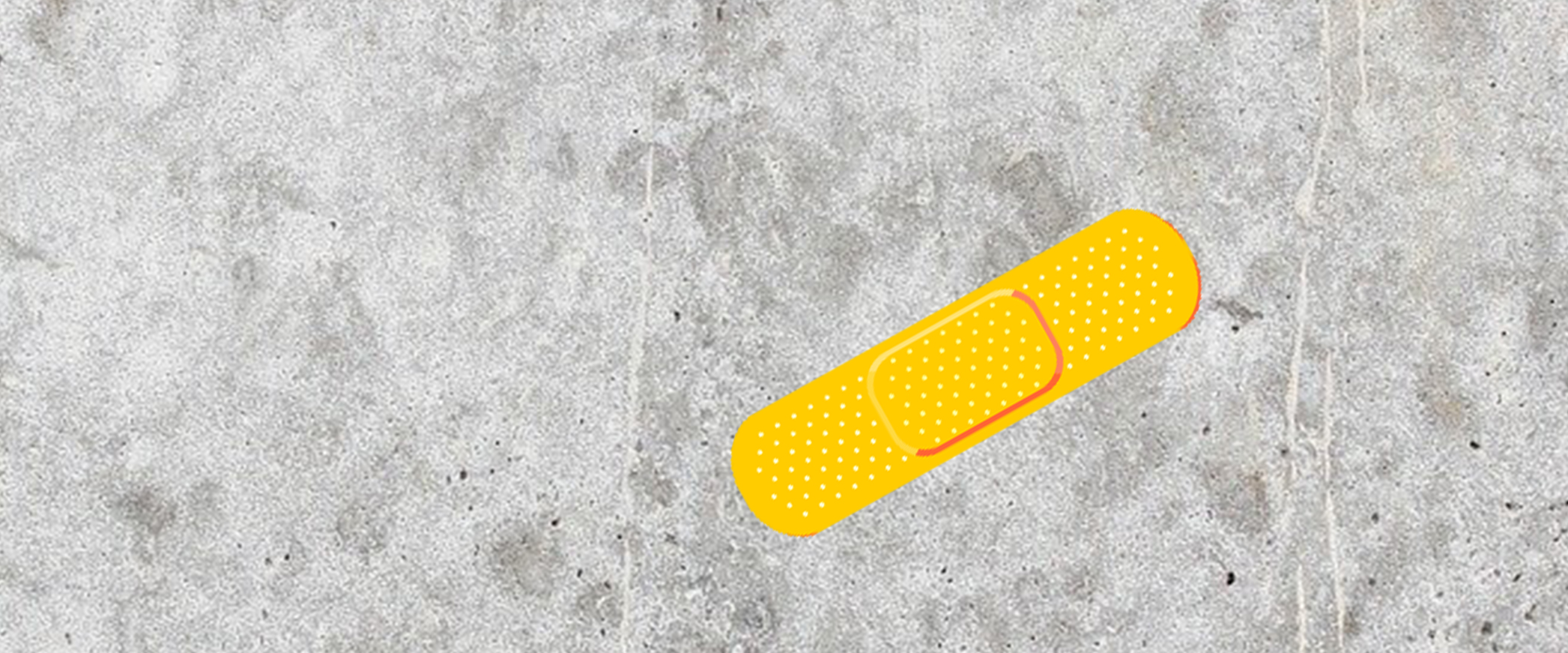
Even though our personal stories and experiences are so different, I think it goes without saying that 2020 was hard on everyone – and nothing says hard like the color of concrete. I felt like Ultimate Gray was a reminder of what was lacking and, for many, still is. Ultimate Gray lacks color, it lacks personality, it lacks excitement and it lacks connection. While they did pair Ultimate Gray with her Illuminating counterpart, throwing yellow into the mix felt lazy and more like an insult – false hope and toxic positivity in the form of a yellow Band-Aid on a concrete floor at the end of a very difficult year.

Fast forward to today: it’s early April, the windows are open, the birds are singing and I’m having a change of heart. Many of us have been able to open our social circles a bit more, we are hugging our loved ones again, the Ultimate Gray days of winter are behind us and our mornings are Illuminated with warm sunshine and the sounds of spring.
While I might not always agree or enjoy certain design trends, I can appreciate one that is rooted in bringing people together and starting a new, brighter chapter. I can’t promise I’m going to propose a gray/yellow color palette to my clients anytime soon, but I can promise I’ll embody the spirit of Pantone’s inspiration as we see more of one another face-to-face. Together, we can fortify ourselves with Ultimate Gray’s strength and Illuminating’s hope as we continue to overcome uncertainty in the coming months and years to come, waving our garish yellow and gray pompons every step of the way.
