Many people look forward to the change in seasons or maybe their favorite holiday but in the design community, a new year means one thing: the announcement of the Pantone Color of the Year. As designers, we have to admit that the Pantone Color of the Year is an important piece of interiors trivia. The Color of the Year is a clear indicator of what we will be seeing in the next few years not only in design but in fashion, graphics, branding and retail environments.
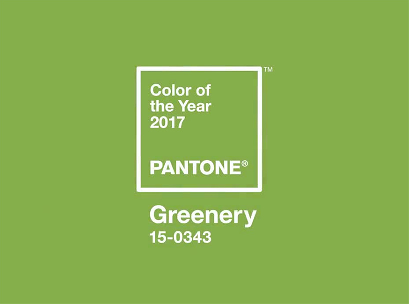
This year’s selection is not only a color but also an idea. The Pantone Color of the Year is Greenery, PANTONE 15-0343. It’s a bright springy tone with a yellow-green hue that fast forwards my brain to the first days of spring (and allergies). The color is equivalent to a reenergizing deep breath that brings new perspective and fresh clear (watery) eyes. When I first saw the press release, I thought it might be a double entendre… a nod to the environmental footprint and all of the good stewardship for the environment with being “green” and earth friendly. As I read more of the explanation of why they chose this particular hue, I actually think it’s a good decision for this new year in 2017.
(Image by Pantone)
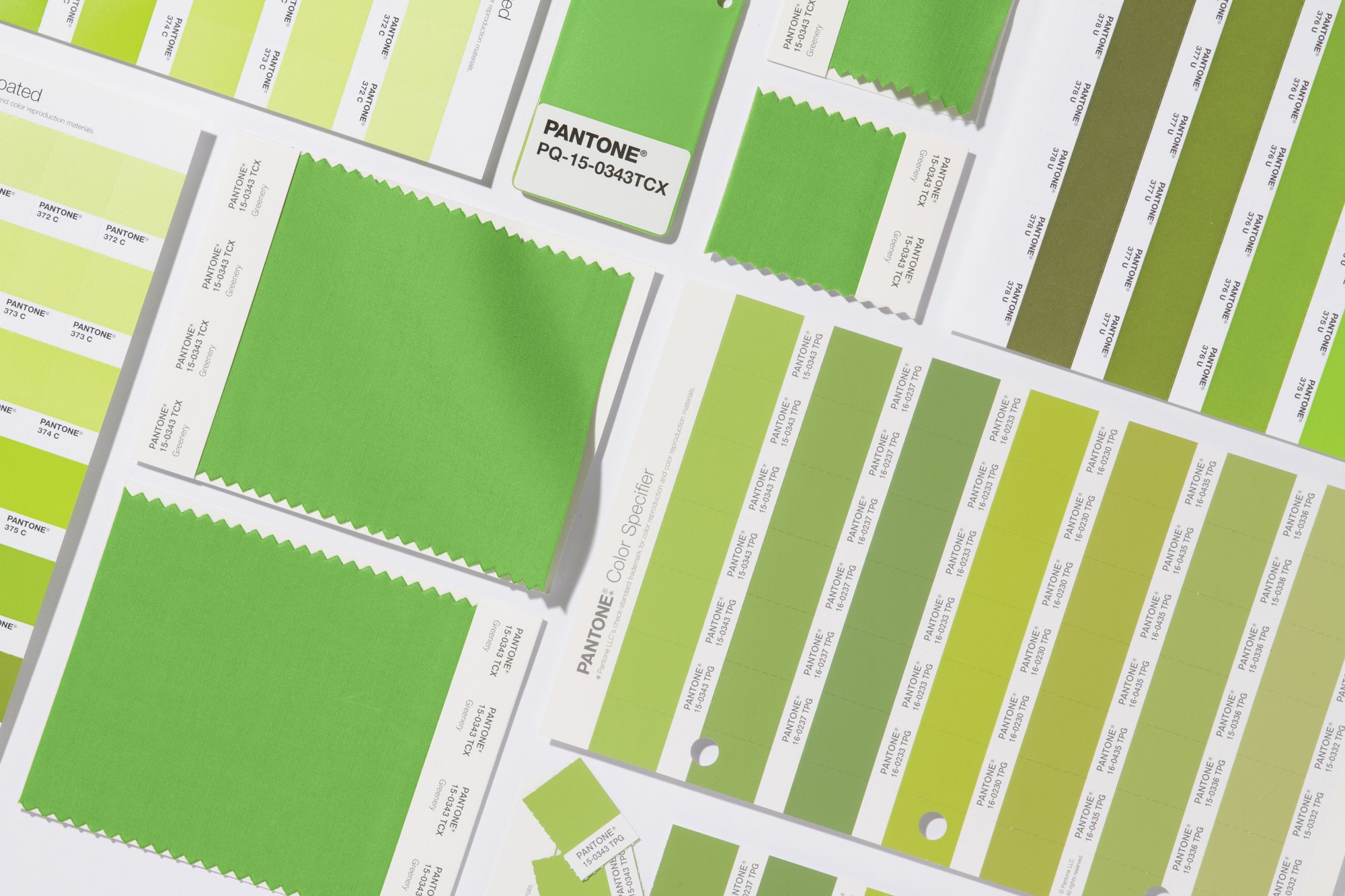
The color is meant to provoke an idea of rebirth and new beginnings which after the political cycle that we’ve had- I think most people would be happy for any new energy. It’s also an obvious ode to nature. As a designer, I turn to the natural environment quite often when I think about color palettes and what works. I always think: “If it occurs in nature, then it’ll look good in a space” whether that be the warm hues of a sunset, or the bright shades of a flower or even a blade of green grass. I’ve been personally working on a few WELL building projects recently and have been looking at the biophilia connection in design. Biophilia is a concept that suggests that we possess a biological tendency to connect with nature and other living elements. By incorporating environmental elements and natural patterns throughout the design, we strengthen that connection to nature for our clients and their built environments.
(Image by Pantone)
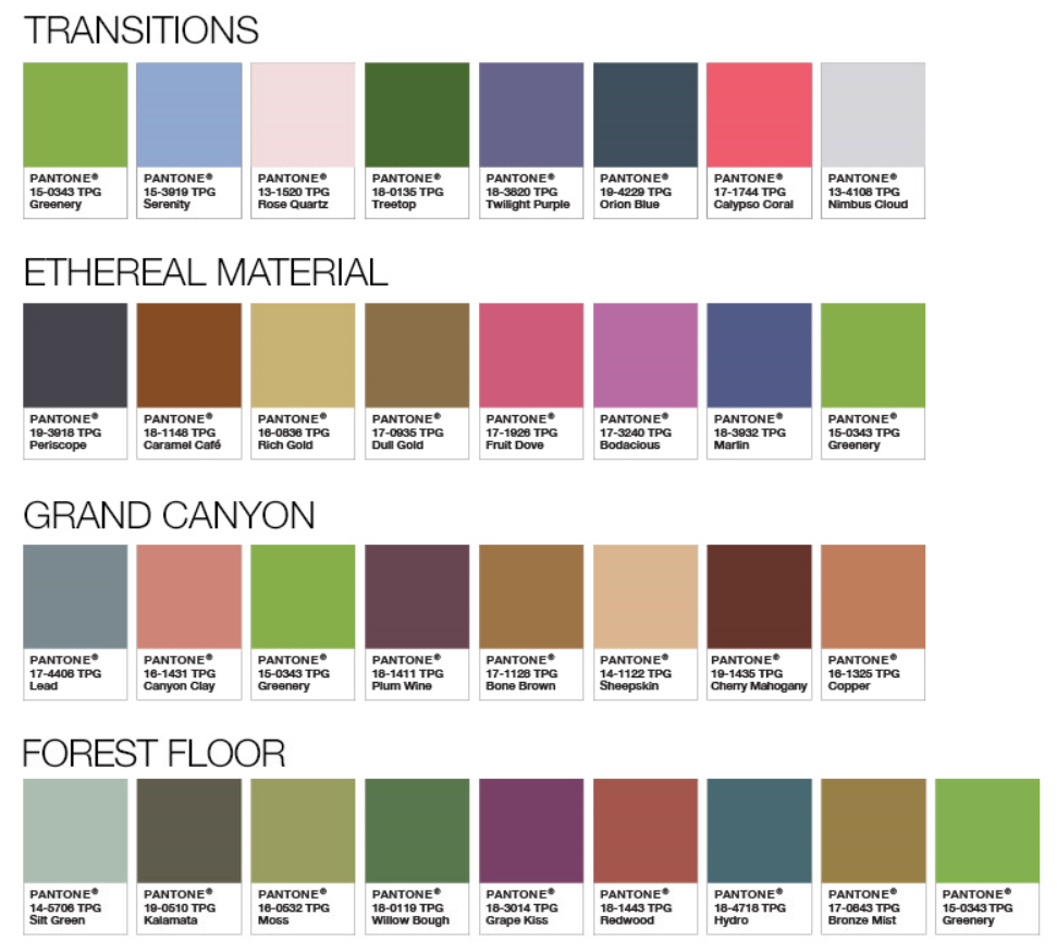
I do enjoy that they stressed that green can actually be a neutral and went as far as to pair it with several different palettes of more jewel-toned hues to pastels to even neutrals and cool grays. I do tend to see shades of green as a neutral. For example, we have green grass in our front yards (hopefully) and that doesn’t really affect the color or aesthetic of our house. I appreciate the fact that Pantone is pushing people to think of neutrals not just as a white, tan, gray, or black but also other colors that occur naturally in our environment. It definitely helps designers- like myself -try to introduce pops of color like a fun green hue into a space. It’s our job as designers to acknowledge that nature’s influence is all around us and should be incorporated in our interior environments just as much as it is in our exterior environments.
(Image by Pantone)
So the next question is when they do the color of the year is that all we use for the rest of the year? Do we throw away our fan decks and just do green every project, across the board? Of course not, but it is nice to have a knowledge of it and possibly introduce it into the spaces that we design. It definitely will be an indicator for what you’re going to see in other consumer driven industries. And hey, you look pretty cool and trendy if you can speak with some intelligence about Pantone colors, right?


