Mickes O’Toole, a former Lawrence Group client, contacted LG when the legal firm had outgrown their previous office space. Unfortunately, Mickes O’Toole had run out of expansion and growth space at their previous site and had to undertake a full relocation to be able to accommodate their growth projects.
A relocation offered Mickes O’Toole an opportunity to rethink their workplace strategy, real estate objectives, furniture selections, and aesthetic. Being a Traditional Law firm, their workplace planned for large, assigned office space that offered minimal options for future growth and expansion. Similar to rest of the workplace market, Mickes O’Toole wanted to leverage their expansion needs to explore what a post-pandemic workplace might look like for their firm.
A relocation of Mickes O’Toole’s office space not only meant additional square footage at play, but it also allowed Lawrence Group to look at right sizing the assigned offices. A smaller office footprint allowed the planners to create more spaces for future staff while expanding the collaborative and shared spaces available to the entire firm. Traditional large law offices were replaced with right sized exterior offices and also created interior offices with glass fronts. New office furniture and new workstations incorporated height adjustable and ergonomic setups in addition to updating the aesthetics throughout the building.
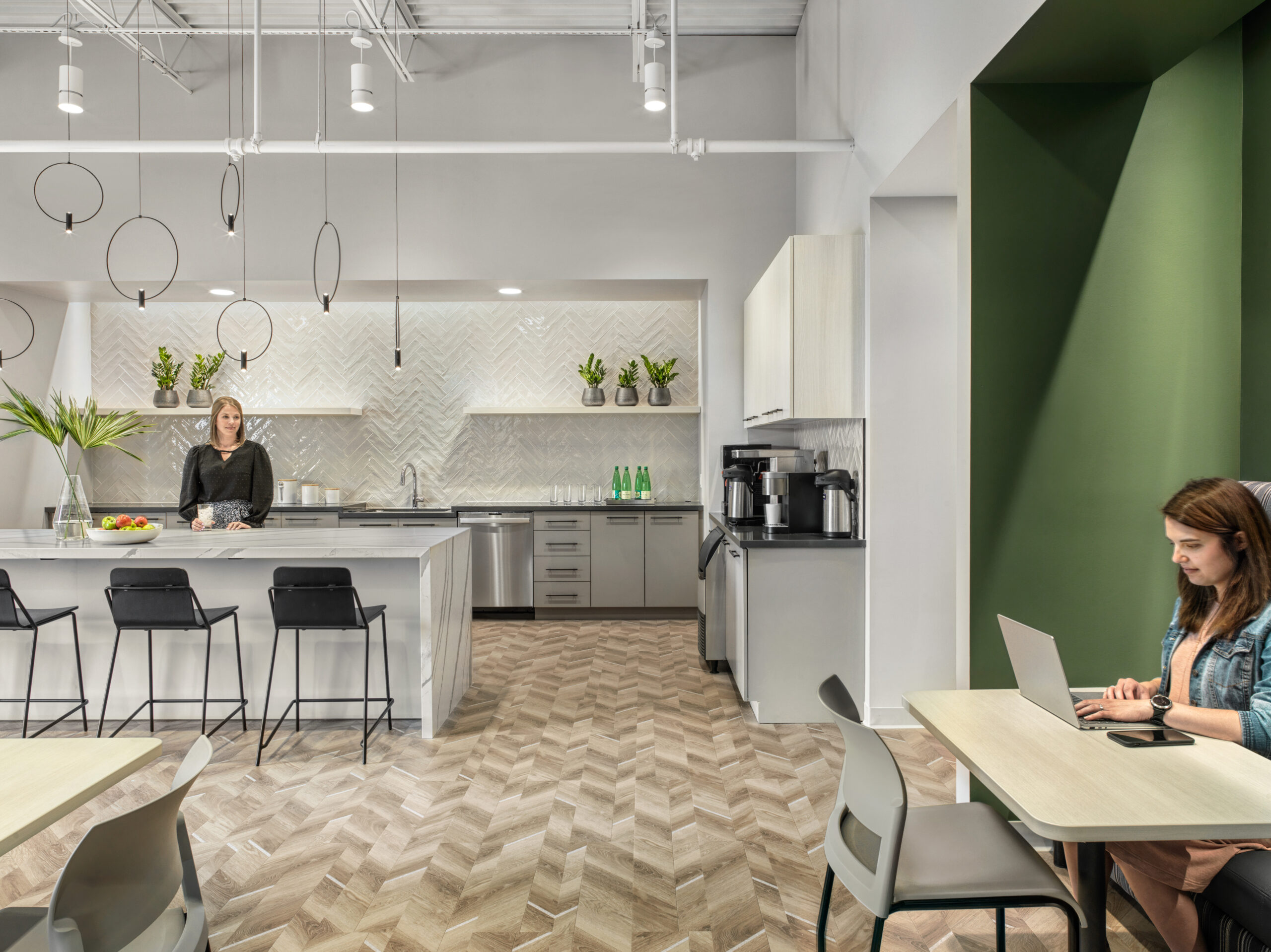
The new workspace was designed to focus on improving shared spaces. This included implementing additional tech enabled meeting spaces and collaborative areas. A new expanded work café was planned with an emphasis on exterior glass with daylight and views, and access to outdoor patio for all staff. The café has areas to lounge, work, and meet. Multiple types of seating options and amenities create a multipurpose space that allows employees an area to escape from their assigned space, enjoy a latte, or simply thrive in a space outside of their prescribed work environment. The café is meant to be an 8-hour space and is even capable of hosting a company-wide meeting.
The aesthetic inspiration looked to provide an updated take on traditional law office finishes, rich wood tones, soft textures, touches of their brand green that create a light and bright workspace. This design allows them to accommodate for their current needs and be able to plan for their future. Overall, the redesign and expansion has been a boon for recruiting new staff and pushing Mickes O’Toole into its next chapter.

