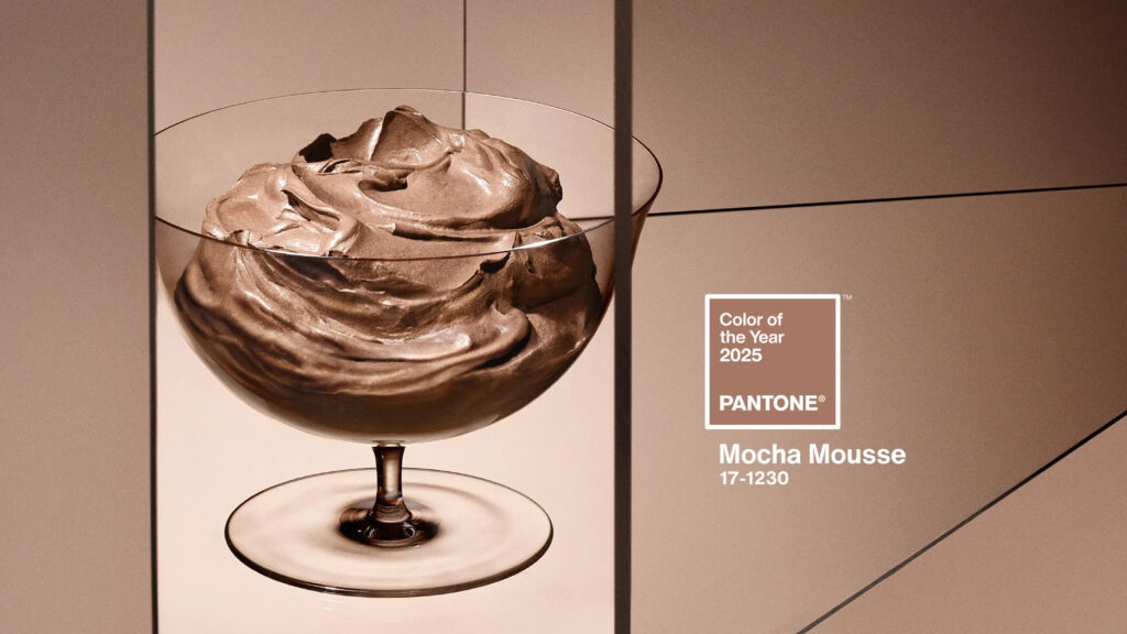
As we look to 2025 with optimism, we leave an eventful year behind us. What are we searching for this year? What are we craving? Each winter, we wait anxiously for Pantone to summarize the global mood through a unique color that embodies the influential role color plays in our lives. Color connects us and captures our collective mood while inspiring industries from fashion to interior design. This year, Pantone has named its 2025 Color of the Year…drumroll please… PANTONE 17-1230 Mocha Mousse.
A “luxe-looking neutral reminiscent of chocolate and coffee,” Pantone Vice President Laurie Pressman describes Mocha Mousse as an extension of our desire for comfort, and the indulgence of simple pleasures. (Dallas Morning News, Mary Grace Granados) Many of us enjoy and look forward to our morning cup of coffee. It becomes our morning ritual, adding comfort and joy, perhaps giving a quiet and contemplative start to our day or allowing us the time to connect with others over coffee. Then, later in the day, we treat ourselves to chocolate, adding that little additional indulgence. Dessert? Yes, please!
Along with our gastronomic and emotional ties to Mocha Mousse, this color can be utilized in various ways to design interior environments that create varying moods. This year we are stepping back into neutrals. Warm neutral brown tones are said to be timeless; they inject a sense of calmness and belonging, creating our desire to rediscover serenity. These colors are approachable while also being sophisticated. The abundant neutral tones are trendy and versatile. In interior design, they are delicate and exude natural elegance celebrating simplicity, authenticity, and connection.
Lawrence Group interior designer, Christy Lederer, shared “I am an interior designer specializing in wellness, and Mocha Mousse evokes that feeling of peacefulness and tranquility, enhancing the design of areas of respite. It lets us take on the feelings of coziness, warmth, and security. It works wonderfully as a base and pairs effortlessly with other natural colors like beiges, greens, blues, and terracottas that could be incorporated into the design to help provide positive distractions. These combinations create relaxing and well-balanced environments, ideal for boosting well-being.”
On the flip side, if paired with more vibrant colors, the palette could boost productivity such as in workplace environments. The color also refers to nature and sustainable materials such as wood, regenerated leather, and eco-friendly fabrics, promoting a design philosophy mindful of the environment.

Mocha Mousse sample palette
Outside of interior design, Mocha Mousse is being used in fashion to create sophisticated monochromatic warm looks; a “relaxed elegance.” Although the fabric is neutral, the texture elevates the design. As we learned from Miranda Priestly in The Devil Wears Prada, it’s not just a color, it’s been selected for us! As in interior design, it can also be paired with complementary colors. In merchandizing, Motorola has designed a phone utilizing Mocha Mousse to create “artistic design innovations.”
Daniela Venturini, Wayfair’s art director and trend forecaster, affirms that, “Mocha Mousse captures a global longing for comfort, contentment, and everyday indulgence.” The color’s association with the familiar and delightful qualities of chocolate and coffee makes it irresistible, striking an emotional chord tied to comfort and pleasure. Perhaps this year we are searching for connection and comfort and the ability to enjoy the simple pleasures of our lives.

Source: Sitlosophy


